https://poiemaweb.com/css3-position
CSS3 Position | PoiemaWeb
position 프로퍼티는 요소의 위치를 정의한다. top, bottom, left, right 프로퍼티와 함께 사용하여 위치를 지정한다.
poiemaweb.com
1. position 프로퍼티
static (기본위치)
relative (상대위치)
absolute (절대위치)
fixed (고정위치)
+ top, bottom, left, right 프로퍼티와 함께 사용하여 위치를 지정한다.
1. static은 기본값이며 이미 설정된 position을 무력화하기 위해 사용될 수 있다.
2. relative 기본 위치(static으로 지정되었을 때의 위치)를 기준으로 좌표 프로퍼티(top, bottom, left, right)를 사용하여 위치를 이동시킨다. static을 선언한 요소와 relative를 선언한 요소의 차이점은 좌표 프로퍼티의 동작 여부뿐이며 그외는 동일하게 동작한다.
<! DOCTYPE html >
< html lang = "en" >
< head >
< meta charset = "UTF-8" >
< meta name = "viewport" content = "width=device-width, initial-scale=1.0" >
< title > Document </ title >
< style >
div {
width : 200px ;
height : 200px ;
border : 1px solid ;
}
.move {
background-color : gray ;
}
</ style >
</ head >
< body >
< div class = "move" > left-top </ div >
</ body >
</ html >
기본
relative 를 통한 위치 이동
.move {
background-color : gray ;
position : relative ;
left : 100px ;
top : 100px ;
}
static 을 적용하여 left , top 값을 무시하여 기본 값으로 되돌린다.
.move {
background-color : gray ;
position : static ;
left : 100px ;
top : 100px ;
}
기본값, 기본값으로 되돌림 정도로 이해하면 좋을듯 하다.
1.3 absolute (절대위치)
부모요소 기준으로 자식요소의 좌표 프로퍼티 적용 (top , left ... )
자식 : relative -> 부모 기준으로 위치
자식 : absolute -> 부모, 조상이 모두 static 경우 -> document body 기준
자식 : absolute -> 부모나 조상이 static이 아닌 경우 -> static 이 아닌 가장 가까운 상위요소를 기준
<! DOCTYPE html >
< html lang = "en" >
< head >
< meta charset = "UTF-8" >
< meta name = "viewport" content = "width=device-width, initial-scale=1.0" >
< title > Document </ title >
< style >
body {
display : flex ;
justify-content : center ;
}
div {
width : 300px ;
height : 300px ;
border : 1px solid ;
}
.parent {
position : relative ;
}
.move {
background-color : gray ;
position : absolute ;
left : 100px ;
top : 100px ;
}
</ style >
</ head >
< body >
< div class = "parent" >
< p > parent </ p >
< div class = "move" > left-top </ div >
</ div >
</ body >
</ html >
부모 : relative
자식 : absolute
-> 부모 기준으로 left , top 적용한 지점에 위치
.parent {
position : static ;
}
부모 : static
자식1 : relative
-> 부모 기준 위치
자식2 : absolute
-> document body를 기준 위치
요약하면 relative 는 부모를 벗어날 수 없지만
absolute 한 자식은 static 인 부모 요소의 영역을 벗어나서 위치할 수 있다.
1.4 fixed (고정위치)
네비게이션같은 메뉴바가 화면을 따라오게 할 때 사용
<! DOCTYPE html >
< html lang = "en" >
< head >
< meta charset = "UTF-8" >
< meta name = "viewport" content = "width=device-width, initial-scale=1.0" >
< title > Document </ title >
< style >
body {
display : flex ;
justify-content : center ;
}
div {
width : 300px ;
height : 300px ;
border : 1px solid ;
}
.parent {
position : static ;
}
.move {
background-color : gray ;
position : relative ;
left : 100px ;
top : 100px ;
}
.ab {
position : fixed ;
}
</ style >
</ head >
< body >
< div class = "parent" >
parent-static
< div class = "move" > relative </ div >
< div class = "move" > relative </ div >
< div class = "move" > relative </ div >
< div class = "move" > relative </ div >
< div class = "move" > relative </ div >
< div class = "move" > relative </ div >
< div class = "move" > relative </ div >
< div class = "move ab" > fixed </ div >
</ div >
</ body >
</ html >
다음과같이 스크롤을 내리더라도 fixed 는 고정되어서 화면에 보여지는것을 알 수 있음
2. z-index 프로퍼티
z-index 프로퍼티에 큰 숫자값을 지정할수록 화면 전면에 출력된다.
position 프로퍼티가 static 이외인 요소에만 적용된다.
<! DOCTYPE html >
< html lang = "en" >
< head >
< meta charset = "UTF-8" >
< meta name = "viewport" content = "width=device-width, initial-scale=1.0" >
< title > Document </ title >
< style >
div {
width : 300px ;
height : 300px ;
border : 1px solid ;
}
.move {
background-color : gray ;
position : absolute ;
}
.red {
background-color : red ;
z-index : 1 ;
left : 150px ;
top : 150px ;
}
.blue {
background-color : blue ;
z-index : 2 ;
left : 200px ;
top : 200px ;
}
.green {
background-color : green ;
z-index : 10 ;
left : 250px ;
top : 250px ;
}
.yellow {
background-color : yellow ;
z-index : 20 ;
}
</ style >
</ head >
< body >
< div class = "move red" ></ div >
< div class = "move blue" ></ div >
< div class = "move green" ></ div >
< div class = "move yellow" ></ div >
</ body >
</ html >
absolute , fixed 일땐 위와 같이 나오는데 relative 일땐 조금 다르게 나온다.
위로 겹치지 못하고 빨간색의 공간을 양보해주면서? 그 이후부터 50px , 50px 씩 이동한 느낌
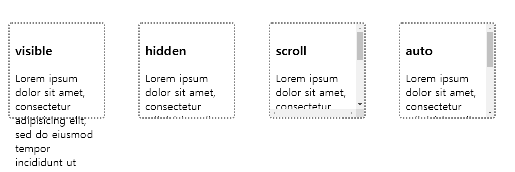
3. overflow 프로퍼티
< style >
div {
overflow : hidden ;
overflow-y : auto ;
}
</ style >
특정 방향으로만 스크롤을 표시하고자 할 때는 overflow-x 또는 overflow-y 프로퍼티를 사용한다.